“Going Paperless” Losing its Allure

By Robin Kantor

A few years ago, everyone touted about how the world would soon go paperless: no more book printing, newspapers, magazines, and so on. However, it now seems that all those marketing messages about the environmental benefits of online documentation are falling on deaf ears.

A study funded by the trade group Two Sides North America recently found that taxpayers who were encouraged to file online instead of by mail were reluctant to do just that. The study also conducted research on why that is the case. It discovered a number of reasons, such as:

Many people prefer or need paper documents. Paper is seen as safer, trusted and more secure. This isn’t surprising given the recent onslaught of media stories about identity theft, privacy breaches and hacking.

People also find it easier to read their documents on paper and printing copies to keep for themselves, negating the paperless aspect.

Then there are the people without internet access or who, as is the case with many seniors and the disabled, lack the skills/ability to go online.

Consumers are now more apt to recognize corporate environmental claims for what they really are: a shift of corporate printing costs to consumers. The skeptics feel it is inappropriate for companies to cite environmentalism when that is not the real motive.

Also, paper is not seen as a “bad” product but, rather, as highly sustainable when it is responsibly produced, used and recycled, especially when compared with electronics.

Therefore, marketing claims that going paperless is “greener” are not only misleading but ineffective. Newark Trade is proud to be a part of the “green” trend of promoting and using real paper!

A Printed Calendar in a Digital World – NT Calendar Case Study

By Robin Kantor

Problem: Newark Trade had been providing calendars as a holiday gift for years, but it was a standard calendar imprinted with the company information. It did NOT showcase the company capabilities. Clients were bored and didn’t keep or display them. We found a way to insure they would be displayed and eagerly anticipate their arrival.

Solution: To completely design a calendar each year featuring the printing and design capabilities of the staff.

  • We have staff members take and submit calendar-worthy photographs.
  • We redesign the month-grids so that everything is completely custom and unique.
  • We find a timely theme for each year to keep it relevant, often featuring new equipment capabilities, and/or some sort of reader interaction.

What we did:
We insist each year has a different theme and all-new visuals.

Some of the past calendars include:

“Creativity in Type” spelled out the month-names using letters made of found objects that look like letterforms. For our 75th anniversary in 2013 we enjoyed going back to our roots to celebrate the shape and forms of type in the world around us.


“Enticing Your Appetite,” (the Food Calendar). This 2015 calendar showed frameable photos, by our own Paul Carracino, of different fruits and vegetables, and invited readers to go to our website and download two staff-created recipes for each food-of-the-month by using a free Augmented Reality app.


“The Coloring Calendar,” featuring drawings inspired by photos taken by staff photographers. In 2016 the public was revisiting the relaxation of coloring, and we had a monthly contest in which people could submit their colored-in drawing in hopes of winning a Coloring Book.


“Colors and Textures,” our 2017 calendar, showcases our newest digital press that has the ability to print clear and white toner. By printing striking images on unusual papers we hope to inspire creative ways for our clients to use the printer’s capabilities.


2018 is our 80th anniversary, and we produced “Go Places with Newark Trade,” with scenic images from around the country (and world), again using photographs taken by our staff. Each month has a unique QR code, scannable with your smartphone camera, that takes you to a 360º street-view of where that specific photo was taken.

Results:
Each year our clients now eagerly anticipate receiving our printed calendars to see what the concept is.

  • We know they will be hung on clients’ office walls or bulletin boards, making it easy to see how to reach us, every day!
  • There will be a novel, fun way to interact with the calendar.
  • The award-winning images also serve a useful purpose, helping clients to organize their days and their lives at the same time they have an ever-changing view.

Client feedback:
“It’s always a pleasure to open the box and see what you guys/gals have thought up” … “so creative and unique” … “we get to admire your work every day!” … “stunning and innovative.”

The Typographic Industry Evolves – Part 2

by Bob Wislocky

In the mid-1960’s John W. Seybold, a noted typographic industry consultant, stated “Lead Is Dead.” He was referring to the fact that Phototypesetting was rapidly replacing Hot Metal Typography with higher productivity and better quality. John’s prediction of Hot Metal’s demise was correct, only his timetable was off. By the mid-1970’s most commercial typographers were using phototypesetting machines such as the Mergenthaler VIP to produce high quality typography on photographic paper or film.

Newark Trade purchased two Mergenthaler VIP typesetting output machines in 1974. The VIP was considered a 2nd generation phototypesetting machine since it didn’t use the mechanical technology of the original 1st generation phototypesetting machines that mimicked Hot Metal linecasters. The VIP used film negative type fonts to create images on photographic film or paper.

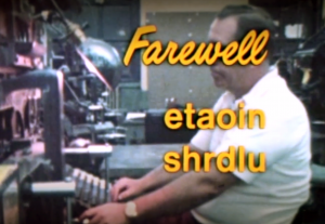
In 1978, the last Hot Metal edition of the NY Times was printed as can be viewed in the documentary, “Farewell, etaoin shrdlu.” The letters referred to the first two banks of lower case keys on the Linotype keyboard. The following day the NY Times composed its first phototypeset edition.

In the 1970’s, the VIP was the gold standard for commercial typographers until the Mergenthaler 202 was introduced in 1978 and became the new gold standard. The 202 was considered a 3rd generation phototypesetting machine since it used “digital fonts” (although not Postscript yet) and imaged the RC paper or film using a Cathode Ray Tube (CRT) versus film fonts on the VIP. Since fonts were very expensive, could not be shared, and the end product was photographic film or paper, it kept end-users from setting their own type.

The VIP was capable of outputting 80 newspaper lines of type per minute while the 202 was capable of outputting 800 newspaper lines per minute. Productivity increased tenfold in one decade. The VIP and 202 had depended upon code-driven “Front-end” minicomputers like CCI, Penta and Quadex to drive them. The operators could not see what the type looked like until the paper or film was processed. These machines could not output graphics – just type. Photos and line art still had to be processed offline and stripped in.

Two events were very important that significantly affected the typographic industry and changed the typographic marketplace forever. They were the introduction of the Apple MacIntosh in 1984 and the Apple Laserwriter in 1985 that used Postscript fonts.

By 1990, the VIP and 202 became obsolete. Typographers found it necessary to purchase Postscript imagesetters such as the Mergenthaler Linotronic L330 and become Service Bureaus to maintain their client base. Designers now had control of the page layout. The L330 was considered a 4th generation imagesetting machine since it was capable of outputting type, art, photos and film color separations for printing – all things that Postscript software supported.

By 1998, Service Bureau work had diminished with the introduction of computer-to-plate imaging equipment that was installed by the offset print industry. Newark Trade added printing and design to enhance our typographic services.

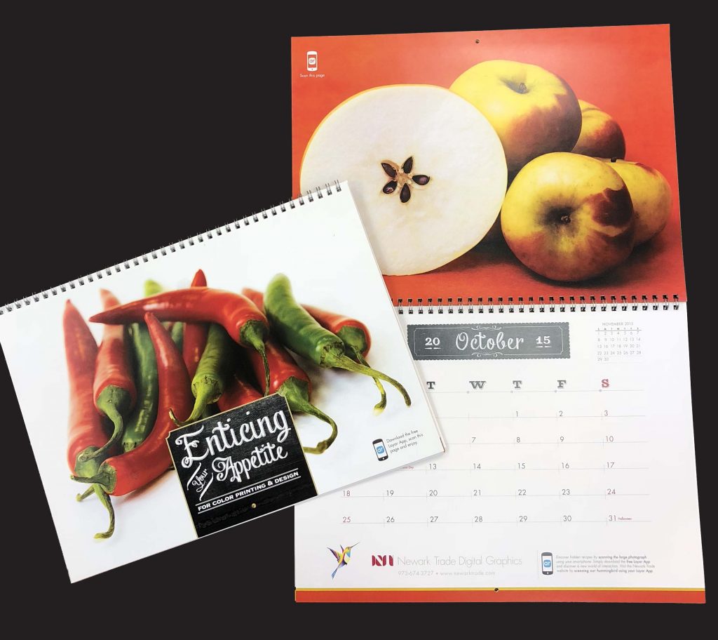
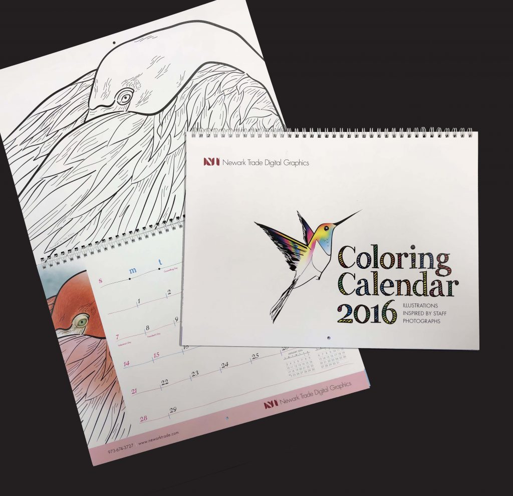
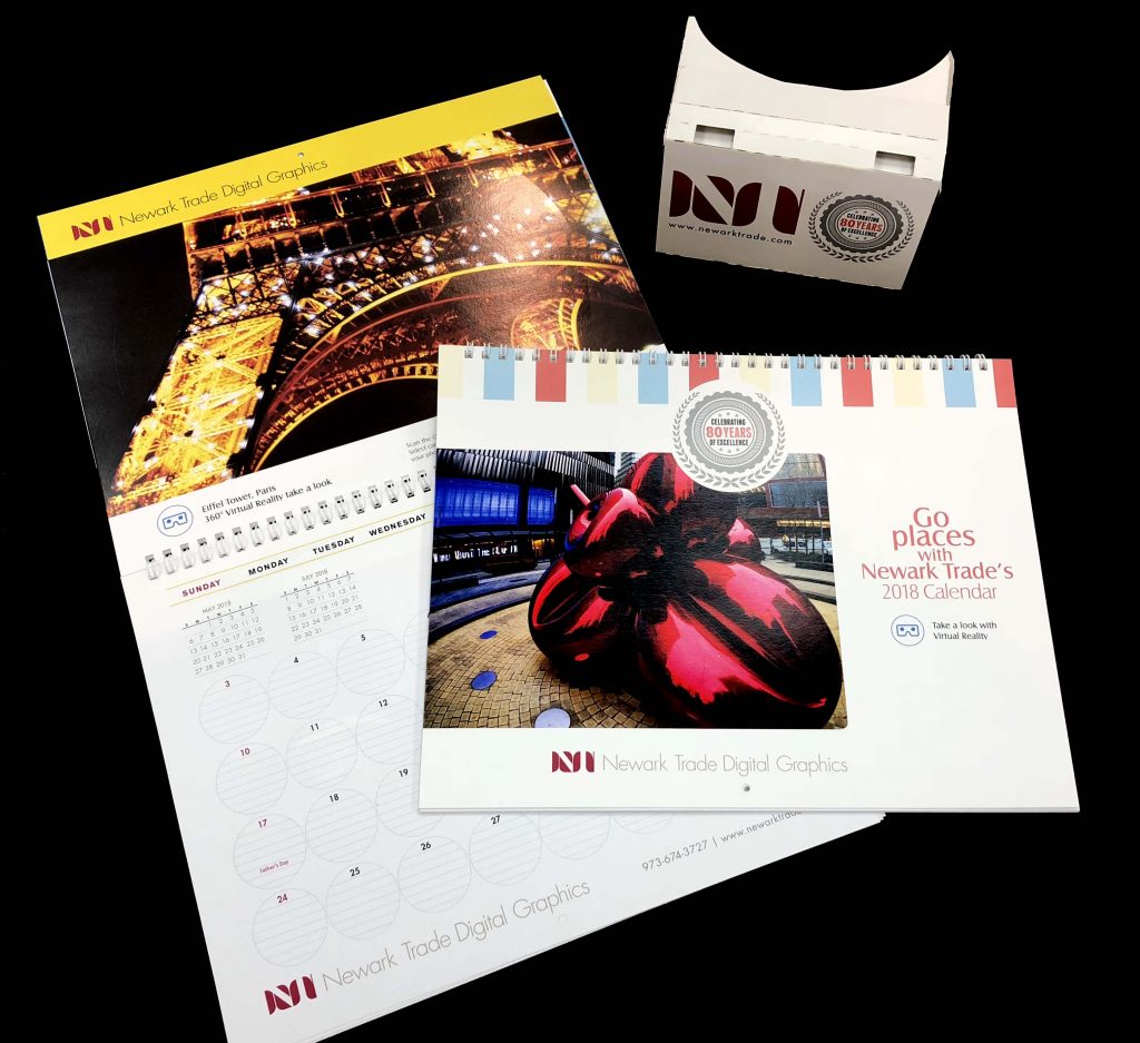
Printing remained vibrant until 2008 when the Great Recession impacted the use of print and mailing with less costly web marketing. However, in the past 10 years, marketers have gradually shifted their thinking to multi-channel marketing. The web is no longer a singular marketing force. Today there is a strong resurgence in using print to target an audience and supplementing it with web-based marketing. Marketers have gained a new insight and appreciation of printing as an important component in multi-channel marketing. Good design, along with targeting printing to a more selective and qualified audience, is getting the higher results marketers have been desiring.

The future is bright for all who are willing to adapt and change and listen to their clients regarding their needs.

Minimal is Memorable

by Robin Kantor

I go to a LOT of networking events, and over the years have amassed a wide variety of business cards. I keep them in a thick binder filled with pages of clear plastic pockets for standard business cards. (I also scan them into a searchable database, but that is fodder for another blogpost). However, I do find myself mentally classifying them as great design, classy/elegant, and/or memorable.

Lately, I have seen a new subset in the “memorable” category: minimal. There was a great article by Meg Fry in the April 9, 2018 issue of ROI-NJ. Some of the highlights are below.

The card of Amanda Parks, who works with NJ non-profits, is an excellent example. The front has only her name along with “Nonprofiteer, Runner, Coffee Lover,” important facets of her life and topics she often discusses while networking, in large letters along the left side of this vertical card.

The back of the card has her contact info. She includes her phone number, email address, Twitter handle, and personal website. Regarding the Twitter handle, Parks said: “Don’t be afraid to include it because someone of a different generation might [not understand].”

She feels that the “information is just vague enough … to remember who I am, [and] encourages them to call and continue the conversation. I find that I get more of a reaction and follow-up … simply because these cards, which stand out against the standard, make people stop and think for a second,” said Amanda. “I am always looking for new opportunities … and want to be able to give them a card that identifies myself in the best ways.”

Clever, minimalist business cards express more of who you are rather than what you do. Business cards can express the real you, and not who you think you should be. People will want to collaborate because of the unique personality that shows through.

As Amanda said, “I believe that my cards say, ‘This is me. If you need me, in whatever capacity, this is how you can reach me, and that’s that.’”

A business card is a minimal space that can have a memorable impact.

Using the 5th Color on the Ricoh C7110s for Creative Effects

By Gary D’Atrio

If you have ever wanted to wow your customers with printed material using metallic inks, shiny foil stamping, pearlized paper or solid color stock only to be frustrated with the high cost or lack of access to variable data, Newark Trade has the solution.

Our digital production printer, the Ricoh C7110s, has a fifth color station which can be used to apply a clear gloss spot varnish or opaque white toner to the printed piece. While the clear gloss adds an extra dimension to the print, it is the white toner that really opens the possibilities for many creative effects.

Metallic ink paper
White toner printed on the paper
4-color printing over the white toner

When using white toner on a metallic, shiny mylar or solid color paper, it lays down an opaque white that simulates paper while allowing the color of the stock to show the areas not touched by the toner. The white areas can then be printed over with 4-color process toner. The result is an impressive printed piece that looks like it was printed with metallic ink, foil-stamping or pearlized paper, but with the digital flexibility of doing short runs or using variable data. The white toner also makes it possible to digitally print clear window clings.

The possibilities are only limited by your imagination.

The Pride of a Family Business

By Robin Kantor and Linda Casale

Bob Wislocky (right) with his father, John Wislocky (left) and his grandfather, Theodore Wislocky (center).

For eight decades, Newark Trade’s family-owned business has been the source of quality service, professionalism and respect. With that legacy comes a journey of a family with deep ties to each other, to their craft and most importantly their clients’ satisfaction.

Bob Wislocky is the company’s third generation owner/president. The chain of command began with his grandfather Theodore, then on to his father John and now to Bob. All three generations had one common goal: to excel at their craft.

Bob’s dedication to family carries over to his entire staff. The atmosphere at Newark Trade is always one of mutual respect by management and the entire team of professionals.

When children grow up in the business, they absorb the skills it takes to succeed. Bob began working in the family business as a boy. “As the owner’s grandson, then son, you really get to know the life that your parents lead. You know what it takes to make a living and take care of your family.”

As the decades passed, the industry continually changed. Always a visionary, Bob kept abreast of not just what was current but what was yet to come. That forward thinking allowed the company to succeed and thrive where many others succumbed to the ever-changing industry demands.

Bob’s philosophy is to remember that family members need to work twice as hard as the other employees, or they won’t earn their employees’ respect. Willingness to be a part of every project and to pitch in at any time is part of the seamless success of Newark Trade.

Resolution Conflict or What’s a Pixel?

By John Ruffi

Ok so here’s the thing: yes, pixel is a unit of measure. Problem is, a lot of people tend to use “pixel” interchangeably with “point,” or worse, they disregard the pixel size of a “rasterized” image altogether.

What’s “rasterized,” you ask? Rasterized simply means an image “made out of pixels.” This pretty much always means an image, as opposed to type (words and sentences), or “vector” images. Yes a rasterized image can have type in it, but it won’t be type you can independently alter just by changing font size or adding or deleting a word. In a rasterized file, the type has basically become a picture of the word or words. Vector art is created using mathematics to describe its appearance, which your computer then interprets and displays, as opposed to raster images. As a result, vector art can be displayed or printed at any size without changing its quality or characteristics at all, as opposed to rasterized images. And herein lies the subject of this missive.

Continue reading “Resolution Conflict or What’s a Pixel?”

Newark Trade Wins
Three Jersey Awards

By Robin Kantor

In attendance at the Jersey Awards Dinner from Newark Trade are Paul Carracino, Robert Wislocky, Robin Kantor, Patty Jurado and Gary D’Atrio.

Newark Trade Digital Graphics won three of the industry-coveted Jersey Awards for creative excellence of design in advertising on Wednesday, June 6 at The Grove in Cedar Grove. This year was the 50th Anniversary Event for the NJ Advertising Club and, in celebration of the “golden” milestone, was even more spectacular than in past years. The exhibit and awards featured almost 300 winners out of over 500 entries in seven categories, from print thru digital, radio and television.

Newark Trade took home three awards: two First Place and one Certificate of Excellence in Newsletter, Calendar and Book design categories.

Robin Kantor is in her second year as the Executive Vice President of the NJ Ad Club.

So…What’s Up with NTInvites?

Newark Trade is all about staying on top of our clients’ needs. Our latest step in that direction is our new online storefront for social printing items: NTInvites.com. There, at your convenience, you can look over the latest in invitations, from the comfort of your home (or office). For social occasions, like weddings and other parties, or business meetings and events, we can help you. At NTInvites.com you can see many different looks, coloring combinations, lettering styles, paper and pricing, and order them securely and easily with a credit card.

Now Newark Trade is your one stop for business and social printing!

Visit https://ntinvites.com/