By Gary D’Atrio
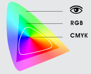
The human eye is amazing. It can distinguish up to 10 million different shades of color. This range of color is known as a gamut and it’s pretty wide compared with what can be displayed on a screen or a printed page. That’s the reason why, as graphic designers, we use color spaces when working on digital and printed material.
There are two basic color spaces that you will deal with: Red, Green and Blue (RGB) and Cyan, Magenta, Yellow and Black (CMYK). Which color space you should work with depends on your final product.
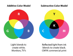
RGB refers to mixing light and is the color space that your computer monitor, TV, smartphone and tablets use to display images on screen. RGB is the color space that you should use for web design or video.
CMYK is what printing devices use in the form of color ink or toner. As you can see from the illustration, the gamut of that color space is much smaller than RGB. As well, the gamut varies depending on the device. Digital toner-based printers and commercial ink-based presses using only four colors (CMYK) will reproduce fewer colors than some inkjet printers using eight ink colors (Cyan, Light Cyan, Magenta, Light Magenta, Yellow, Pure Black, Medium Black and Light Grey).
So how do we manage all of these color spaces and ensure that what we see on screen is close to what we will get on paper? ICC profiles are the answer.
But we will save that subject for another time.